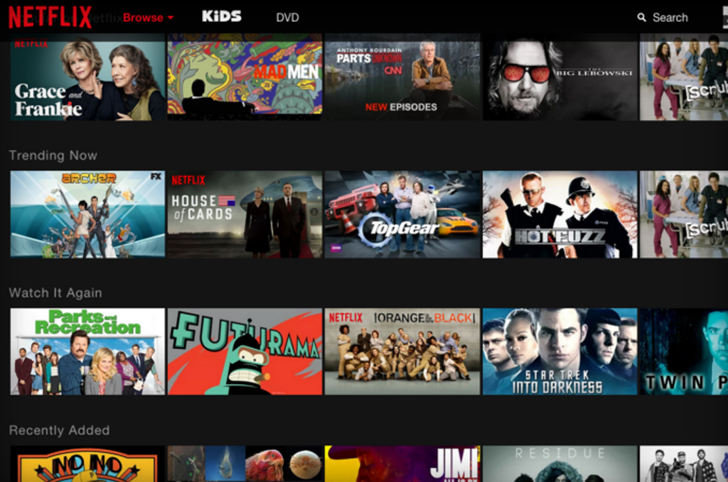
If you’re a Netflix subscriber who frequently binge-watches directly from its website, chances are you’ve gotten dizzy while scrolling horizontally through its carousel of viewing options. If you haven’t, consider yourself lucky. If you have, now there’s reason to rejoice. Starting in mid-June, the Netflix website will come with a redesign that eliminates the endless horizontal scrolling, which has always felt like watching an endless assembly line of movies and TV shows. And if you didn’t like your initial viewing choice, you had to go back and start scrolling and searching all over again.
The new Netflix website promises to make the viewing experience easier. Instead of zinging you to another page, a menu appears when you click on a title’s thumbnail image, offering a synopsis and a tabbed menu bar giving you more clicking options. If you’re not interested, just click out of the menu and you’re back to the home screen and its many, many titles.
Another notable change is that the website’s white background will now be black, mostly to set it apart from main competitor Amazon.
“A white background feels like an e-commerce shop,” Navin Prasad, Netflix’s lead product designer, recently told Wired. “But Netflix isn’t that. It’s entertainment.”