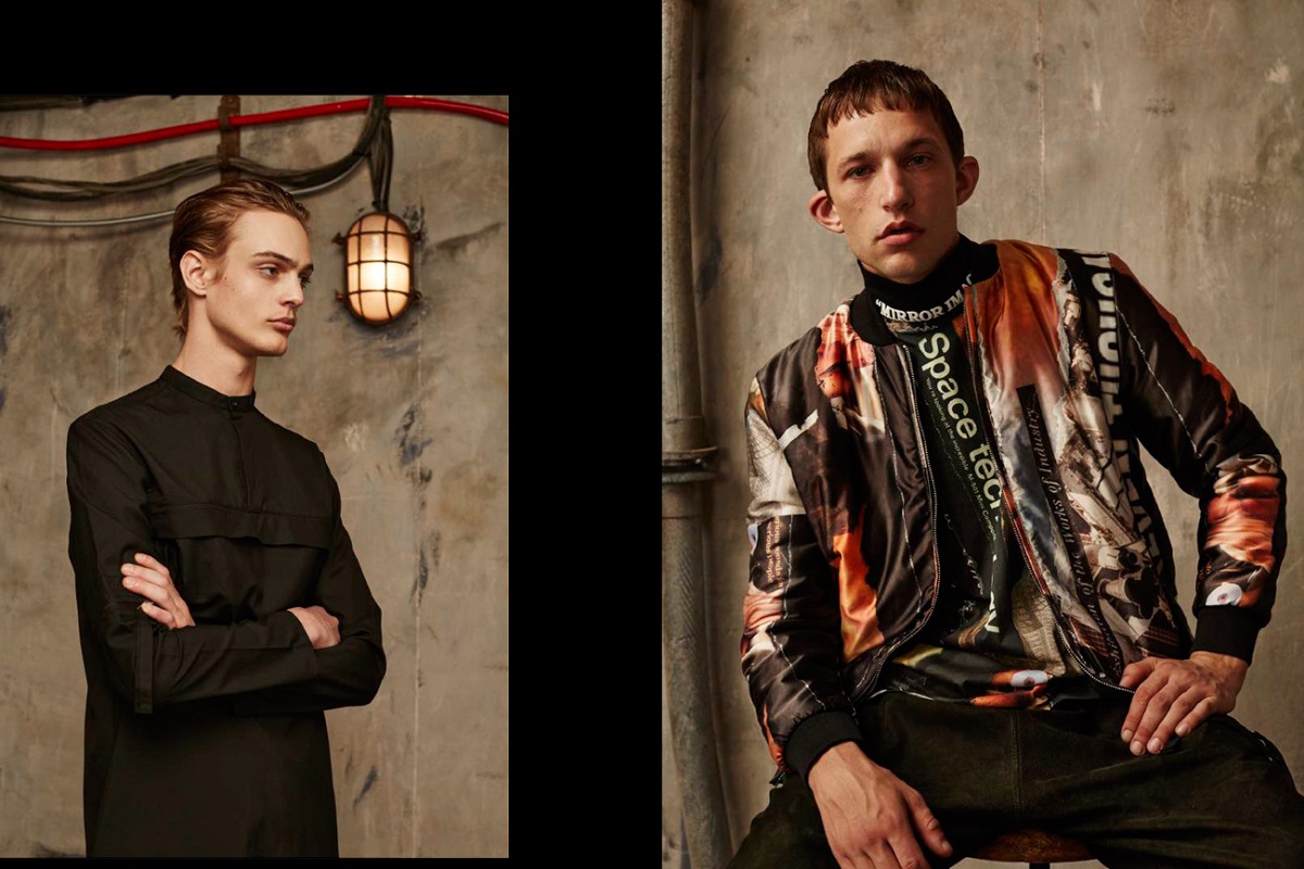
London-based label Blood Brother has been known for being adaptive and ever-changing, and its fall/winter 2016 look book showcases these traits in the best way. The label has a history of elevating and altering the colors and designs of each season’s collections to match their respective seasons. A quality that exhibits intricacy, Blood Brother has always kept its graphics consistent and striking despite the its changing color palettes. The collection as a whole is highlighted by the retro motifs and oldschool objects in the background as we see vintage televisions and phones across the look book. The brand’s attention to modernity and innovation are a strong indication that it knows exactly what is in for this upcoming season. To find more details about the new collection, check out Blood Brother’s site.

![Mosley Tribes Resort/Spring 2010 Lookbook [Eyewear]](https://porhomme.com/wp-content/uploads/2010/02/mosley-tribes-resort-spring-2010-eyewear-0.png)